Collection: Quiet, organized by Matthew Pawlowski (online exhibition)

About Quiet
When I look at visual art I often think about its dynamics and volume. Am I looking at a vibrant, cacophonous work that vibrates like a heavy metal song? Or does the picture appear sharp, static, staccato, filled with tension?
I use terms about sound and volume to describe how I feel about what I see. The world is kind of noisy right now. Sometimes it’s great to look at “loud” art when the world is noisy because it just seems correct. Lately though, I’ve been craving quiet pictures.
There are many ways artwork can be perceived as “quiet.” Some pictures appear soft and have a repetitive spirit that seems comforting, like a pat on the back. That is how I feel when I look at Alice Wiese’s untitled embroidery on cotton fabric. It’s creamy and muted, almost soft. Its rectangular pattern repeats through the page gently with a lilt.
Similarly, Serena Scott’s Old to New, a calligraphic work with one evocative word repeated over and over, filling the page, evokes the same reticent patterning. I see these works as “quiet.” They interest me and provide the viewer the visual space to contemplate them with care.
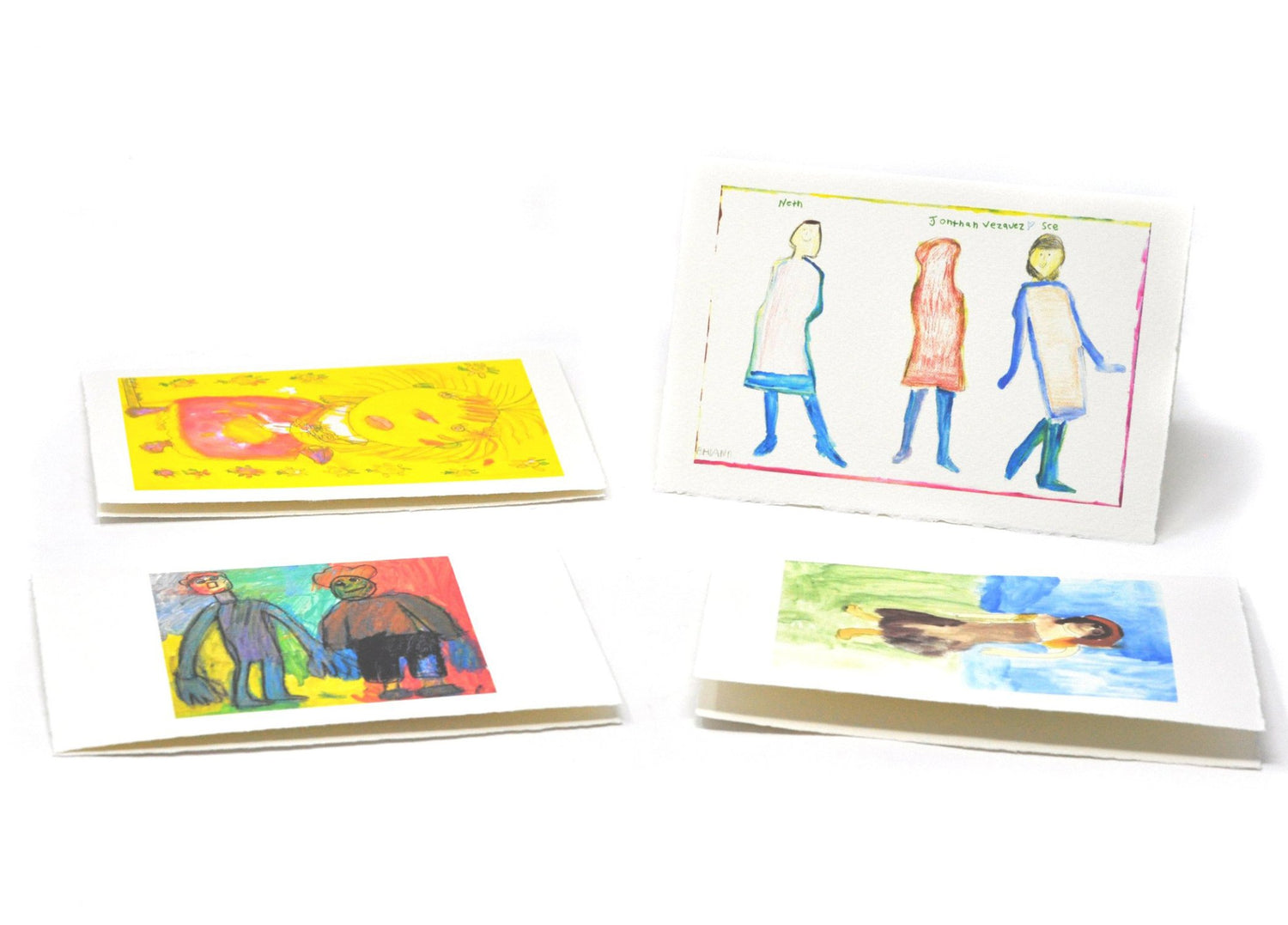
Representational pictures can be quiet, too. Raven Harper’s portrait of Aretha Franklin portrays the singer, mouth closed, arms folded in front of her, in repose. What is she thinking about? It is not often we think of depicting singers hushed, quiet, and contemplative.
Heather Copus’s Kiss Band presents the iconic group in silhouette, their images blotted, negated, whited-out. The loudest band in the world is now made silent by the artist’s hand.
I am a big fan of using text in visual art. Text is a great indicator of the artist’s purpose and how words are used in the artwork tells the viewer much about the intent of what the artist wants us to see. The “volume level” of Sara Malpass’s list drawings vary based on what words the artist has included in the drawing, the color of the paper used, and the general visual impact of the work. I’ve included an untitled list of Sara’s that I think is more of a whisper than a shout.
Keep the idea of volume in mind when viewing art. Maybe create your own sense-based method for clarifying of what you see.
About Matthew Pawlowski
Minnesota-based artist Matthew Pawlowski is interested in the conflict between acceptance and “otherness.” He focuses on an ethereal intersection where gay culture and a larger cultural mindset meet.
Pawlowski lived in California from 1996-2019. In 1996 he opened ESP Gallery, a small, community-based exhibition space supporting local emerging artists and located near the corner of Valencia and 14th Street in San Francisco.
-
Untitled (D1244)
ArtistJoseph RuxRegular price $ 50.00 USDRegular priceUnit price per -
Shadow Testing (D8548)
ArtistMichael NuñezRegular price $ 40.00 USDRegular priceUnit price per -
Kuchisake-Onna (D4935)
ArtistMichael NuñezRegular price $ 60.00 USDRegular priceUnit price per -
Untitled (P1067)
ArtistDanny ThachRegular price $ 900.00 USDRegular priceUnit price per -
Era (D8311)
ArtistSerena ScottRegular price $ 80.00 USDRegular priceUnit price per -
Untitled (D5154)
ArtistKaren MayRegular price $ 100.00 USDRegular priceUnit price per -
Untitled (D4619)
ArtistJulio Del RioRegular price $ 410.00 USDRegular priceUnit price per -
Untitled (D1298)
ArtistHeather CopusRegular price $ 50.00 USDRegular priceUnit price per -
Untitled (D0017)
ArtistSara MalpassRegular price $ 40.00 USDRegular priceUnit price per -
Untitled (D2712)
ArtistErika MartinezRegular price $ 50.00 USDRegular priceUnit price per


You might also like...
View all-
Gifts + Merch
Mugs, gift cards, pins, tote bags, and other functional items made by NIAD Art...
-
Jewelry + Fashion
Jewelry, accessories, garments and wearables made by NIAD Art Center artists. NIAD is an...
-
Sculptures
Sculptures made by NIAD Art Center artists. NIAD is an arts...
-
Works On Paper
Drawings and other works on paper by NIAD Art Center artists. NIAD...
-
NIAD Bookstore
Artists books, zines and publications made by NIAD Art Center artists and...


